Experimenting with html comics
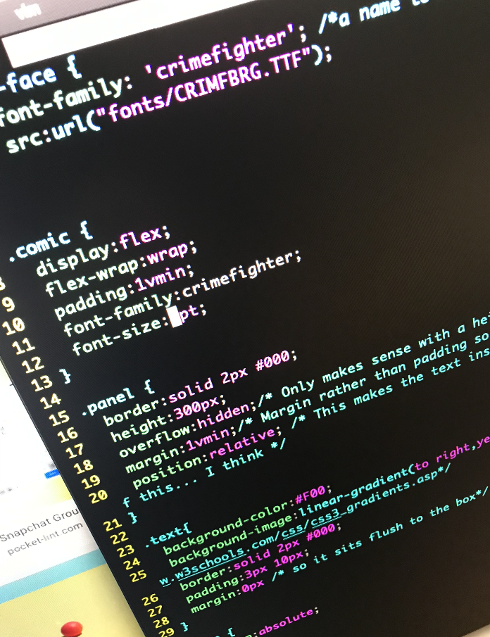
I’ve been experimenting with making comic layouts in html and css. There’s one below. It looks very like the comics from my previous efforts at comics, but there are some crucial differences:
- This version is screen-reader friendly.
- It adapts and moves around if you change the size of the screen.
- I can include links, gifs, videos easily.
- It’s (obviously) easier to host on a website
A major advantage should be that it would be quicker to put together because I can write it directly in as text and have the layout be taken care of.
This might turn out to be a route back into doing daily comics. I’d like that.
The main benefit of the exercise has been to finally get my head around CSS, something I’ve been avoiding for 20 years since it turned up in my first year undergraduate computer science course.
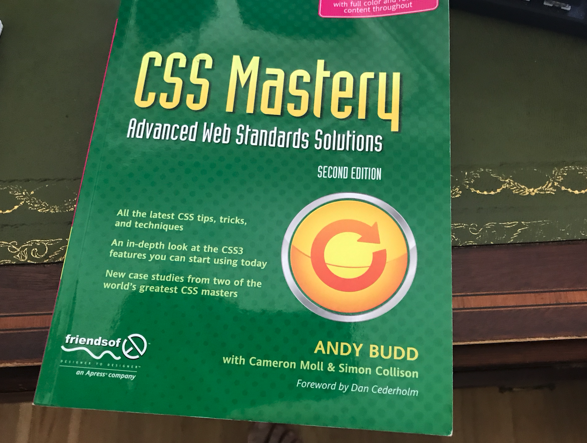
I knew I didn’t have right level of understanding to implement this, and I thought it was a better idea to spend four hours with the textbook than four hours fruitlessly Googling for issue after is and it was well worth it. As I worked thought the textbook lots of things clicked for me that I’d only been lightly aware of beforehand. I still needed an hour of Googling or so and I might go back through the book again in a while now I’ve actually played with some of the approaches.

Thought about making more comics.

So I've been finding out about web design (stuff I should have paid attention to in uni)

It's still very hard to get the code to work.